( 005 ) — Case study
Crystal Montgomery Cleaning
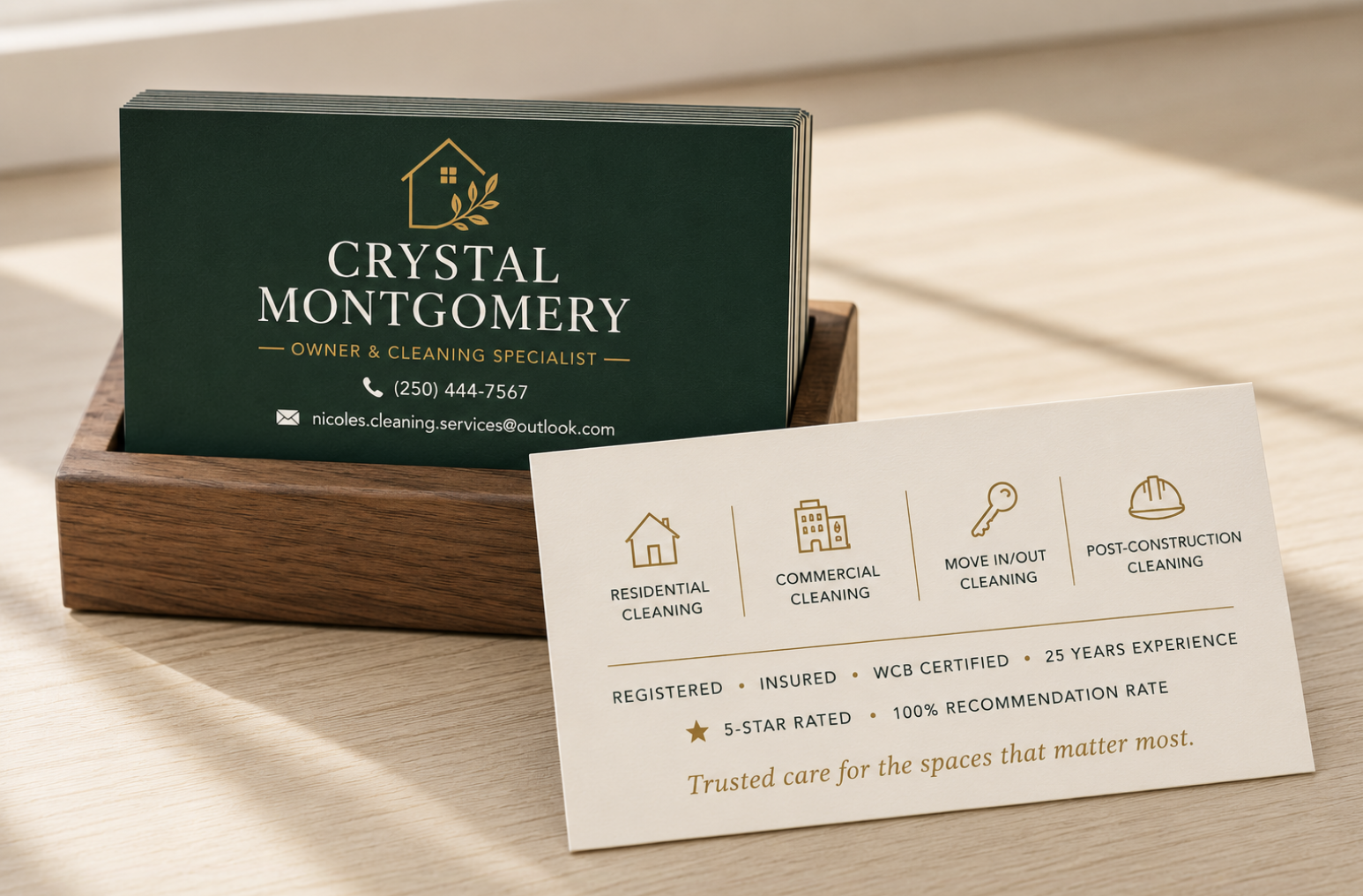
Trusted care for the spaces that matter most.
- Client
- Crystal Montgomery Cleaning
- Industry
- Cleaning Services · British Columbia
- Year
- 2025
- Services
- Brand direction, Logo design, Business card design, Print
01 — The brief
Crystal Montgomery is a 25-year cleaning industry veteran — residential, commercial, move in/out and post-construction — who had built a great reputation but had no real brand to back it up. She came to us without a clear visual identity and wanted to start where it mattered most for her business: a business card she could hand to clients with confidence. The brief was open: take the lead, make me look like the authority I already am.
02 — The approach
We designed a timeless, two-sided card built around quiet authority. A deep forest green front with a warm gold house-and-laurel mark sets the tone — established, trustworthy, premium — while the cream reverse uses a clean four-icon service grid (Residential, Commercial, Move In/Out, Post-Construction) and a tidy credentials line (Registered · Insured · WCB Certified · 25 Years Experience · 5-Star Rated · 100% Recommendation Rate) to do the heavy lifting. A refined serif wordmark, generous spacing, and a single italic tagline — "Trusted care for the spaces that matter most." — finish the piece. Approachable graphics, clean lines, no clutter.
03 — The outcome
Crystal walked away with a card that finally matches the quality of her work — something she's proud to hand out, that positions her instantly as the seasoned professional she is, and that gives her a real starting point for the rest of her brand to grow into.